UX/UI Design of CecotApp
18 Nov, 2025
UX Research and Design process for an e-commerce mobile app
Role: UX/UI Designer, Scrum Master & Project Manager
Timeline: 5 months (iterative Agile process)
Team: Chiara Esposito, María José Toscano Cantares, Sara Yagüe Lobo
Tools: Figma, Miro, Google Workspace
Methods: Benchmarking, User Interviews, JTBD, Empathy Mapping, Heuristic Evaluation, Usability Testing, Agile UX
😶🌫️ Overview
CecotApp is an e-commerce mobile application designed for Cecotec, a leading Spanish home-appliance brand. The objective of this project was to unify all Cecotec services in a single digital ecosystem, improve the user experience across the whole customer journey, and strengthen the brand’s competitiveness through a scalable, user-centred design.
Through a complete UX process , from research to high-fidelity prototyping, I contributed to defining the product experience and delivering a functional proposal aligned with the company’s strategic goals.
💪 Challenge
Cecotec’s digital ecosystem was fragmented across multiple platforms. Users faced:
Difficulty finding and comparing products
Confusing checkout and payment processes
Limited clarity in customer service and warranty management
Visual inconsistency across services
Issues with touch targets, information overload and cognitive fatigue
Our challenge was to simplify, unify and optimise the whole experience while respecting the brand’s identity and business constraints.
✏️ Process
1. Research
I led the research phase alongside my team, focusing on both market insights and real user needs.
Benchmarking:
We analysed three major competitors (Samsung Shop, MediaMarkt, Xiaomi Mi Store) to identify good practices, failures, and opportunities. This helped us define criteria for navigation, checkout, support, personalisation, and brand coherence.
Stakeholder Interview:
We met with Cecotec’s internal design team to understand business goals and technical limitations. Key insights included:
Demographic data of our target users
Search is the most-used feature → improve information architecture
Warranty and product registration were pain points
Post-purchase processes needed simplification
Payment methods felt unclear and insecure
User Interviews:
8 participants aged 25–48
We explored digital habits, e-commerce frustrations, motivations, and product expectations.
Insights revealed:
Users need clarity, speed, and trust during purchase
Comparing products is essential
Customer support must be visible and responsive
Overloaded interfaces reduce confidence
2. Definition
Using the research results, we synthesised insights into actionable frameworks:
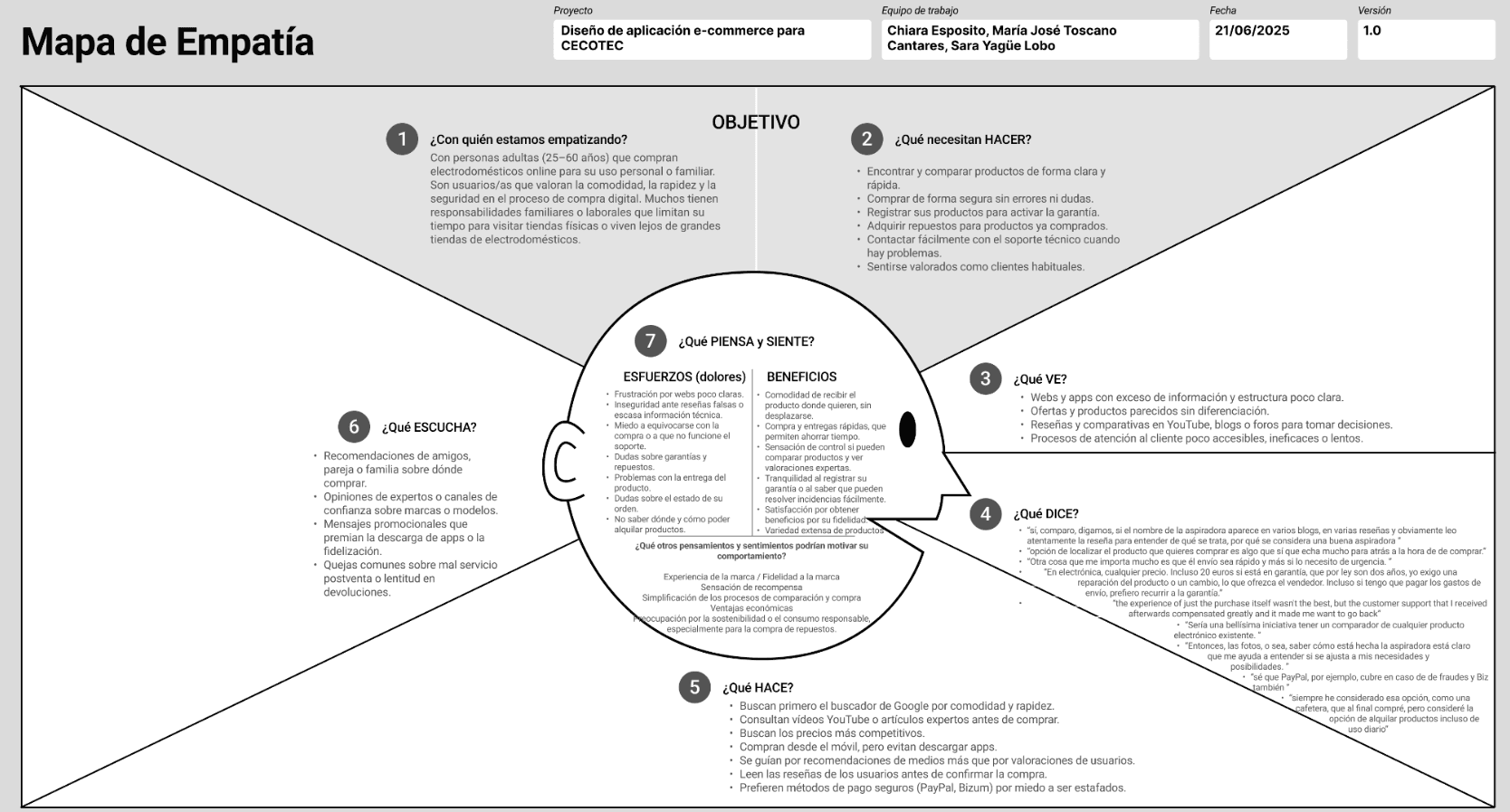
Empathy Map: to visualise frustrations around decision-making, delivery and support
Tree Map: to prioritise problems (information architecture, support, trust, clarity)
JTBD (Jobs To Be Done): to define user goals such as “compare easily”, “track deliveries”, “return products effortlessly”, “find compatible spare parts”, and “pay securely”
These foundations guided all design decisions and ensured the solution stayed aligned with real user needs.
3. Evaluation & Iteration
Through feedback sessions with Cecotec’s team, we detected several usability issues in the early prototypes:
Touch targets below recommended size (44–48px)
Overloaded layouts with too many visual elements
Excessive text that slowed comprehension
Tab bar labels split in two lines, affecting readability
We addressed each issue in a second design iteration to improve clarity, accessibility and interaction patterns.
4. UI Improvements Applied
I contributed to implementing the following improvements:
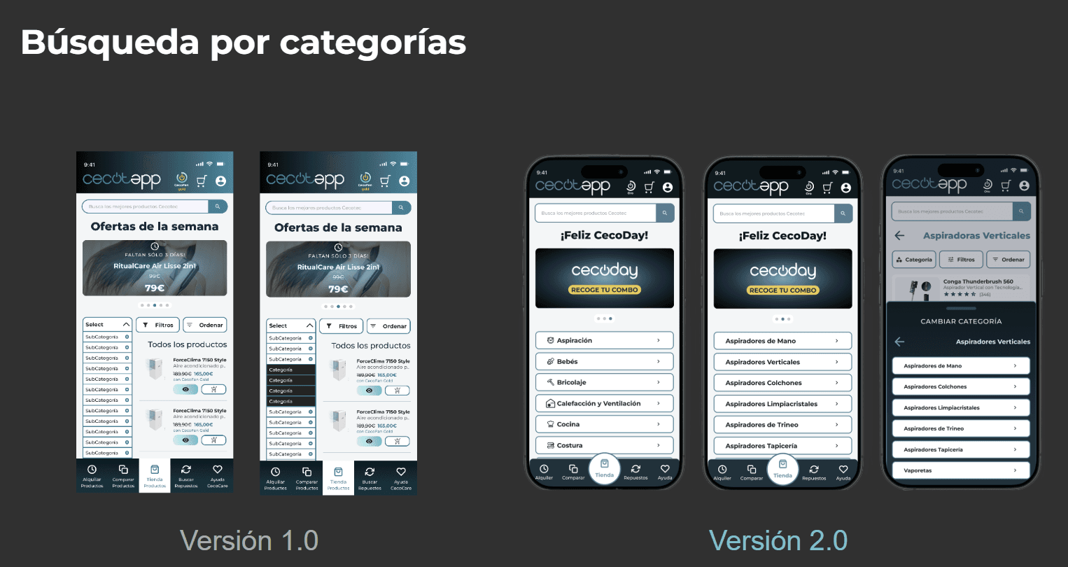
Optimised search experience with category-based navigation
Redesigned tab bar for clarity and correct accessibility standards
Expanded touch targets for better mobile usability
Cleaner visual hierarchy (spacing, font sizes, colour contrast)
Simplified interactions to reduce cognitive load
Enhanced contrast for better legibility and accessibility
🌟 Final Proposal
The high-fidelity prototype includes a fully redesigned experience that integrates all Cecotec services:
Smarter product search (categories, filters, advanced search)
Enhanced product detail pages (media, specs, comparisons, reviews)
Optimised checkout process (secure, guided, simplified)
Product comparison tool
Cecocare: unified support and FAQs
Spare parts & warranty registration
Order management & returns
Cecorent: rental service with flexible plans
Cecofan & Cecoday (loyalty and exclusive benefits)
🚀 Impact
By following a data-driven, user-centred approach, we delivered:
A coherent digital ecosystem integrating all Cecotec services
A simplified and intuitive shopping experience
A prototype grounded in real user needs and validated insights
Design solutions aligned with mobile usability standards and brand guidelines
👀 Next Steps
Run usability tests with real users
Add personalisation features and expand spare-parts management
Create an onboarding flow and microinteractions to enhance engagement
Link to interactive prototype (in Spanish) 👉 here